Case study

Bibi Smit

Branding
Logo

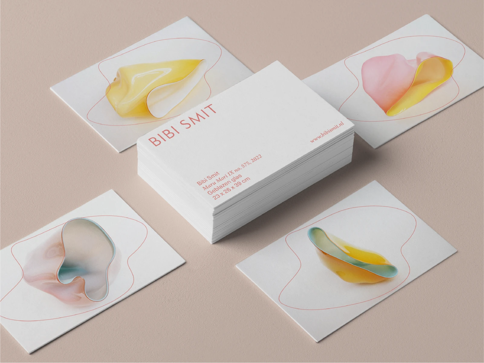
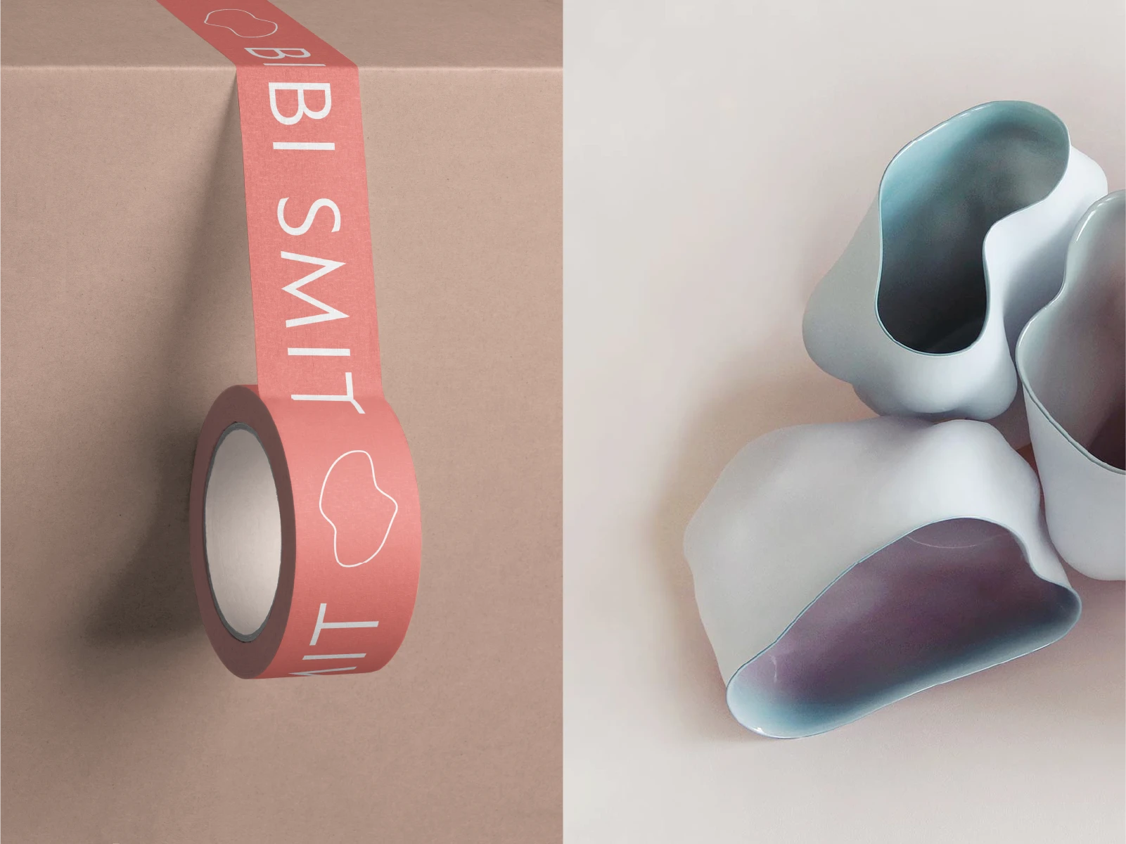
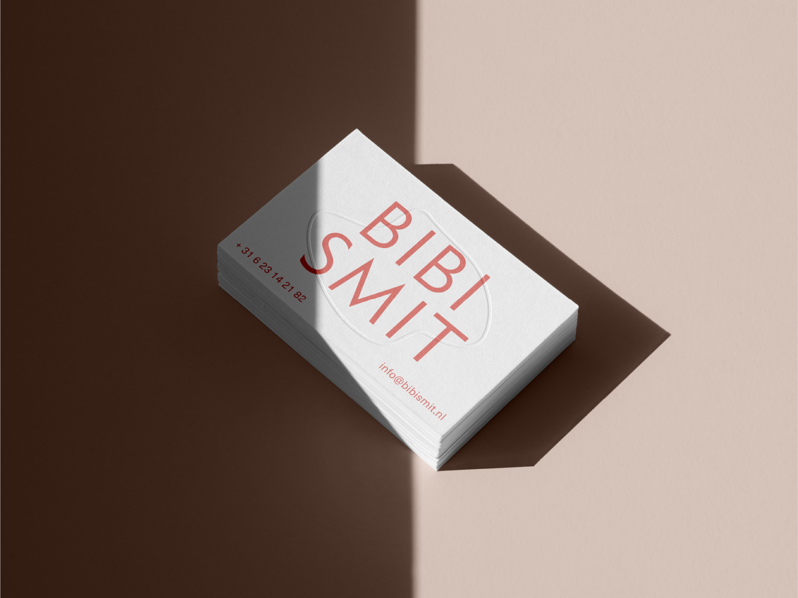
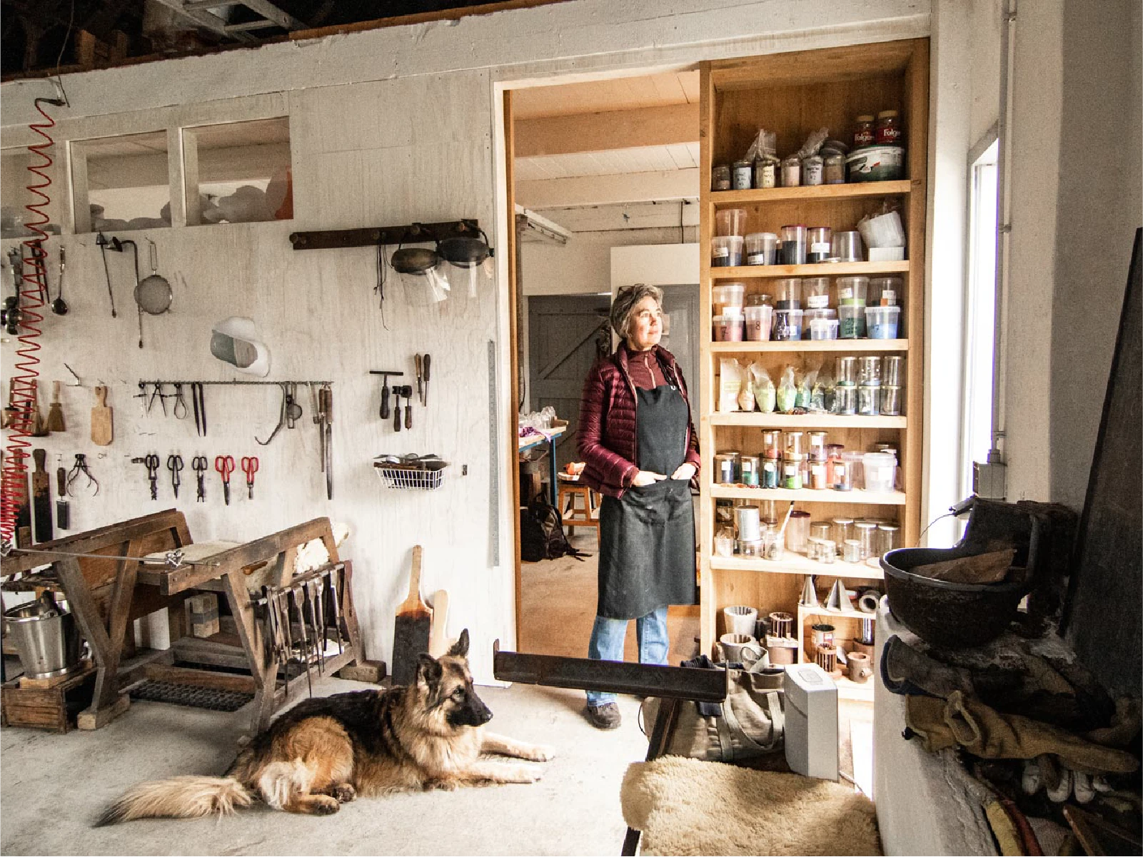
Bibi Smit is an expert artisan working with glass since 1988, with work including The Mauritshuis and Milan Design Biennale. Together we have developed a cohesive visual style to support and enhance her local and international exhibitions.

Strategy

The main goal was to create a visual style that is easy to use. Through design rules and templates, we ensured that all visual identity elements; from email footers and websites, to packaging, business cards, postcards and banners are consistent and aligned.

Design

The challenge was not to override the visual impact of the artwork but to support and enhance it. We achieved this by spending time in the workshop and understanding the process of glassblowing. We created a stylized version of melting glass, by depicting it as a fragile, thin line. This became the main visual component for the identity, which we paired with color and clear fonts to support the visual narrative of the original artwork.

Results

The new visual style has resulted in a coherent presentation, making the design of identity system less complex. This has increased recognizability, and both clients and galleries respond positively to the aesthetics and professionalism of her visual expressions.

No items found.

No items found.

No items found.

No items found.

Logo design

Jasper van Doorn

Visual identity

Jasper van Doorn

Portrait photography

Annemarie Sabelis

Art photography

Frieda Mellema

Other case studies

United Identities

3D
Branding
Logo
Motion

Since 2019 I've been partnering with United Identities to create immersive artwork and promotional materials.

Read more

Make sure to stay in the loop

Thank you! Your submission has been received!
Oops! Something went wrong while submitting the form.